I IN Unveils Andersson Bell Tokyo Store, Concrete & Colour
The flagship retail space in Aoyama features custom furniture and a three-story color progression from red to yellow, set against a 1993 brutalist concrete structure.
Tokyo Flagship Blends Brutalism with Color
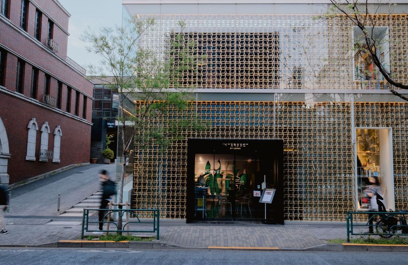
Seoul fashion brand Andersson Bell has opened its first flagship store in Japan, located in Tokyo's Aoyama neighborhood. Local design studio I IN created the interior, drawing inspiration from the original building's architecture, which dates back to 1993 and features an exposed concrete interior.
I IN co-founder Yohei Terui noted to Dezeen the rarity of such a distinct space in Tokyo, allowing for a "bold and radical approach" to the design. The studio's primary goal was to translate Andersson Bell's brand identity of "contrast" into the physical space, introducing a modern layer that complements the existing brutalist character rather than competing with it.
Material Contrast and Saturated Hues
The design by I IN deliberately juxtaposes the building's robust, boardmarked concrete walls with new, glossy, and reflective surfaces. This material contrast forms the backdrop for a vibrant color palette. The store's interior is decorated with warm, saturated hues of red, orange, and yellow.
According to I IN, the red, which is a signature color for the Andersson Bell brand, serves as the initial introduction to the store's aesthetic.
Progressive Color Journey Across Three Storeys
The color scheme is not static but evolves across the flagship's three storeys. Visitors moving through the space experience a gradual transition from red on the ground floor, which is also visible through the large front window, to orange on the next level, and finally to yellow upstairs.
Yohei Terui explained that this progression was designed to be an integral part of the spatial experience, creating distinct atmospheres for each level and a sense of movement throughout the building. Furthermore, I IN custom-made all the furniture specifically for the store's interior, ensuring a cohesive design that integrates with the architectural and color themes.
Implications for Commercial Interiors in Asia
This project offers a clear example for architects, interior designers, and procurement teams working on commercial spaces in Asia, particularly those involving existing structures or adaptive reuse.
The strategy of using stark material contrasts, such as boardmarked concrete against glossy finishes, combined with a progressive, saturated color palette, demonstrates how to define distinct zones and enhance visitor engagement.
Specifiers can consider integrating custom-designed FF&E, as I IN did, to reinforce brand identity and ensure design cohesion within complex architectural contexts, offering a model for retail projects seeking to balance historical character with a modern aesthetic.
Get The Materials Brief.
The week in materials, projects and sourcing, every Tuesday. Free.